Behroob App Redesign
The Behroob platform was redesigned as a more accessible recycling experience focused on simplifying dry waste collection and encouraging long-term environmental participation.
The redesign addressed usability, transparency, and engagement issues by improving request flows, strengthening visual hierarchy, and introducing community-driven sustainability features.
The project also explored how clearer interactions and trust-focused design decisions can make Eco-friendly behavior easier in everyday life.
Friction in the waste collection request process
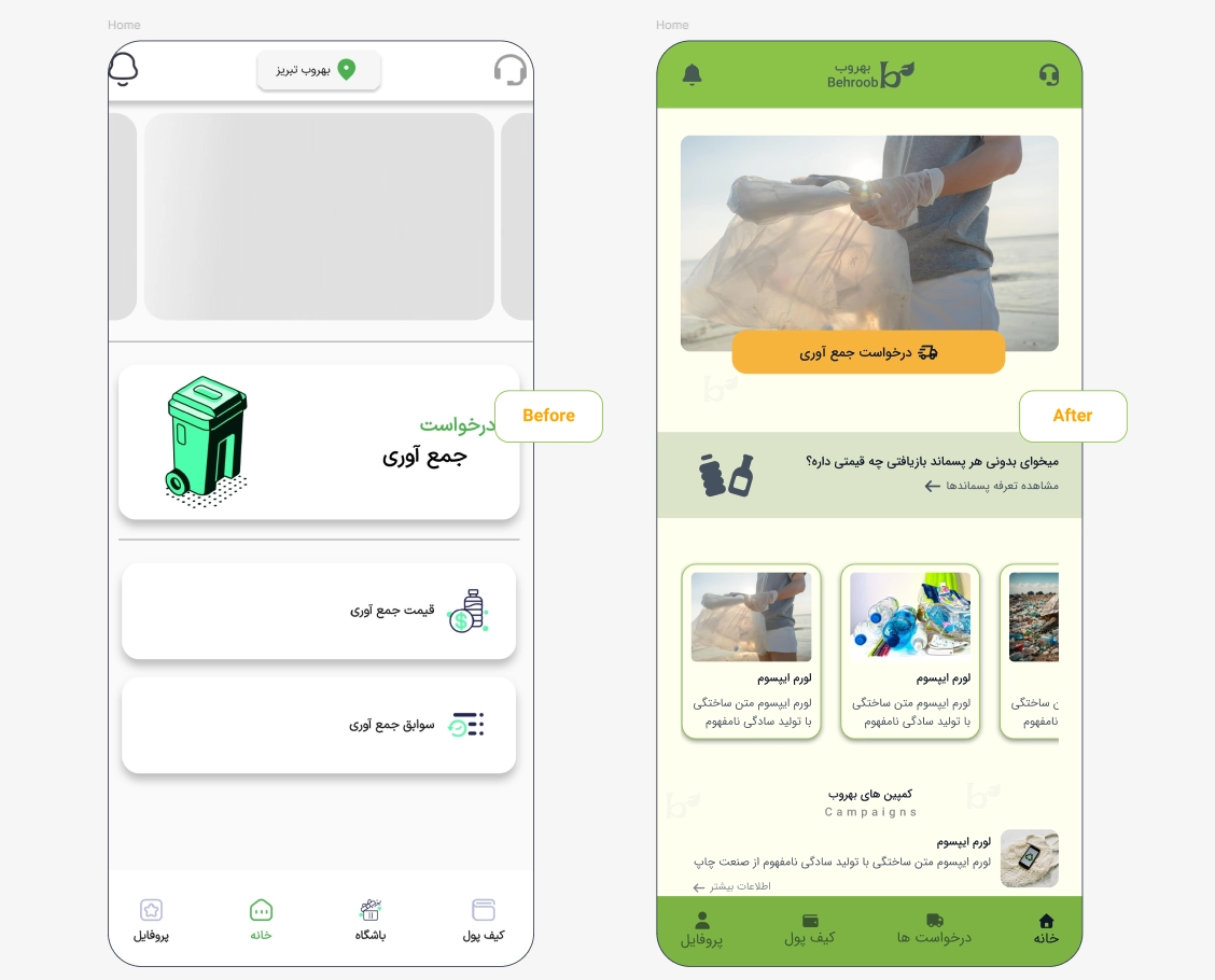
The original Behroob experience contained several UX and UI issues that reduced clarity, usability, and long-term engagement across the platform.
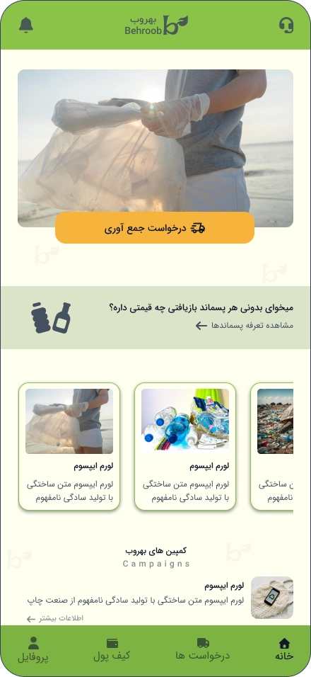
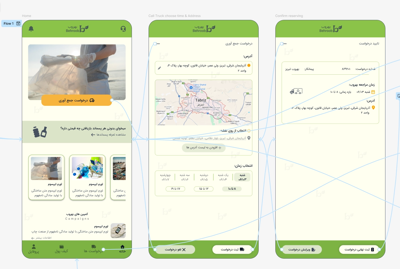
Key problems included unclear visual hierarchy, weak prioritization of primary actions, and a fragmented pickup request flow without a final confirmation step, which sometimes led to submission errors.
The platform also lacked meaningful engagement mechanisms that could motivate users to participate consistently in recycling activities or environmental initiatives.
Creating a More Trusted & Engaging Recycling Experience
The goal of this project was to improve the Behroob recycling experience by creating a clearer, more trustworthy, and more engaging system for waste collection and environmental participation.
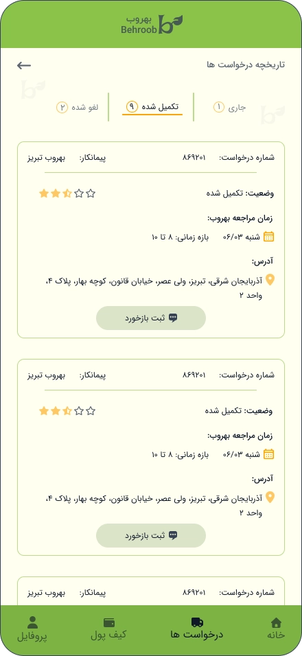
This included improving the pickup request flow with better clarity, confirmation, and user control, while increasing transparency through clearer visibility of submitted requests.
Additional goals focused on strengthening engagement through community campaigns, educational content, and impact-driven information to encourage consistent recycling behavior
Research & Insights
Research focused on analyzing the existing Behroob experience across usability, service flow, transparency, and long-term engagement.
Key findings highlighted unclear request flows, weak action hierarchy, limited visibility into request status, and low motivational support for continued participation in recycling activities.
These insights informed the redesign strategy, interaction structure, and overall user experience improvements throughout the platform.
“For me, recycling is a lifestyle, not a task. I want to do my part in the easiest way possible.”
Approach
The redesign approach focused on improving clarity, strengthening user trust, and simplifying experience through more structured interaction flows and clearer visual hierarchy.
Focus:
- Reducing cognitive load through simplified request flows and clearer action prioritization
- Improving transparency with confirmation steps and better request visibility
- Encouraging long-term engagement through community-driven campaigns and motivational features
Wireframing
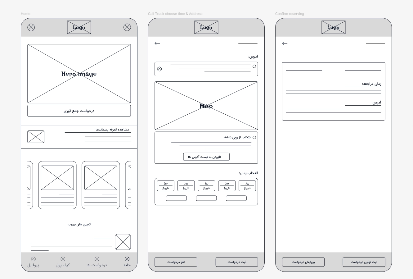
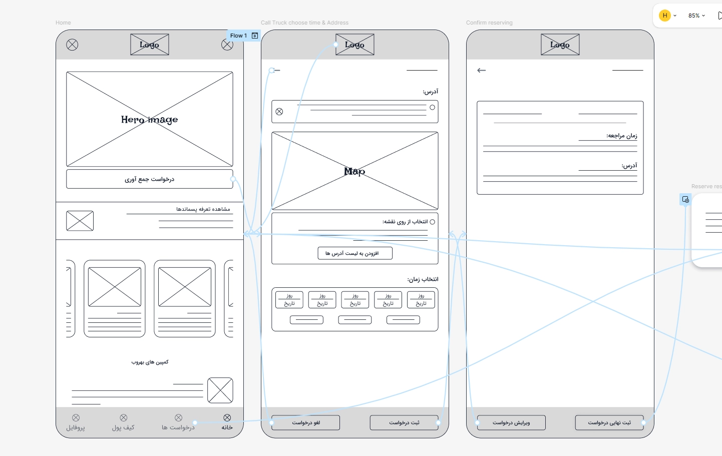
Wireframes restructured the pickup request experience to improve clarity, hierarchy, and user control across the core flow.
Navigation patterns, CTA visibility, and request confirmation were simplified to reduce friction and improve user confidence during task completion.
Low-Fidelity Exploration
Low-fidelity explorations focused on validating navigation clarity, interaction flow, and request structure before moving into refined interface design.
Special attention was given to simplifying the pickup request process, improving content grouping, and creating a more intuitive step-by-step interaction flow.
“A simple confirmation would make me feel more confident.”
Visual Refinement
The visual refinement phase focused on strengthening hierarchy, improving CTA visibility, and aligning with a cleaner, more minimal environmental visual language
Simplified icons, clearer status indicators, and improved color usage were introduced to increase clarity, trust, and overall usability across the platform.
Final Prototype
Final prototypes refined interaction feedback, visual consistency, and transition behaviors across the experience.
Subtle micro-interactions and confirmation states were introduced to improve responsiveness, trust, and overall user confidence during key actions.
Improving Clarity, Trust & User Engagement
The redesign improved clarity across the waste collection flow by simplifying navigation, strengthening visual hierarchy, and introducing clearer confirmation patterns.
Users gained clearer visibility into their requests and a more structured experience throughout the collection process. Community-driven campaign features also introduced stronger engagement opportunities around environmental participation and recycling habits.
Reflections
This project explored how thoughtful UX improvements and clearer interaction patterns can strengthen trust, usability, and long-term engagement within sustainability-focused digital products.
Interested in collaborating or discussing a project?