Touska App Redesign
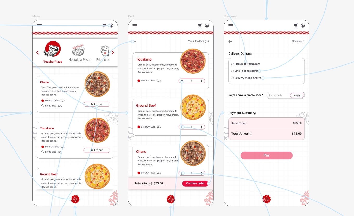
Touska was redesigned from a simple digital menu into a complete restaurant ordering web application that supports the full purchase journey—from browsing items to checkout and order confirmation.The redesign focused on reducing friction during food ordering, simplifying decision-making, and creating a more connected experience across browsing, customization, payment, and fulfillment selection.
Additional features such as multiple fulfillment methods and a cashback loyalty system were introduced to improve convenience and encourage repeat purchases.
Disconnected Ordering Experience
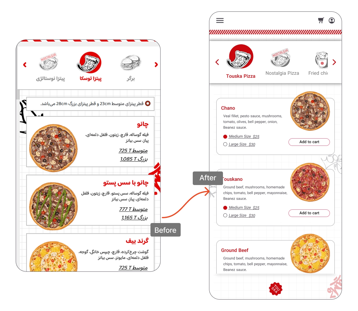
The original Touska experience functioned only as a digital menu and did not support online ordering or purchase completion.
Users could browse food items but still had to place orders physically at the restaurant counter, creating a fragmented and inefficient experience.
The platform also lacked flexible fulfillment options, order visibility, and customer retention mechanisms commonly expected in modern food ordering services.
These limitations reduced convenience, usability, and long-term engagement.
Creating a Seamless Digital Ordering Journey
The goal of the redesign was to transform the existing menu experience into a more complete and user-centered ordering system that supports faster, clearer, and more reliable food purchases.
The project also aimed to improve flexibility through multiple fulfillment methods, reduce friction throughout checkout flows, and strengthen customer retention through loyalty-based interactions.
Research & Insights
Research focused on understanding how users browse menus, compare items, customize orders, and make purchase decisions within fast-paced ordering environments.
The analysis explored friction points in restaurant ordering experiences, expectations around fulfillment flexibility, and interaction patterns users rely on during checkout and order confirmation flows.
These insights informed the navigation structure, ordering hierarchy, and interaction design decisions throughout the project.
“A clear ordering flow depends on aligning information structure with how users naturally filter, compare, and commit to their choices.”
Approach
The design approach focused on simplifying the ordering journey, reducing cognitive load during purchase decisions, and creating a more connected relationship between menu browsing and checkout completion.
Focus:
- Creating a structured ordering flow that supports fast and confident decision-making
- Improving flexibility through multiple fulfillment methods including dine-in, pickup, and delivery
- Strengthening long-term engagement through cashback and loyalty-focused interactions
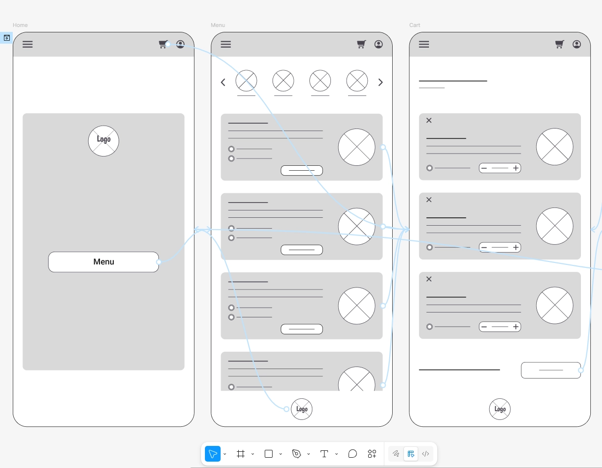
Wireframing
Wireframes focused on building a predictable and easy-to-follow purchase flow across browsing, customization, cart management, and checkout interactions.
Special attention was given to action hierarchy, navigation clarity, and reducing unnecessary complexity throughout the ordering experience.
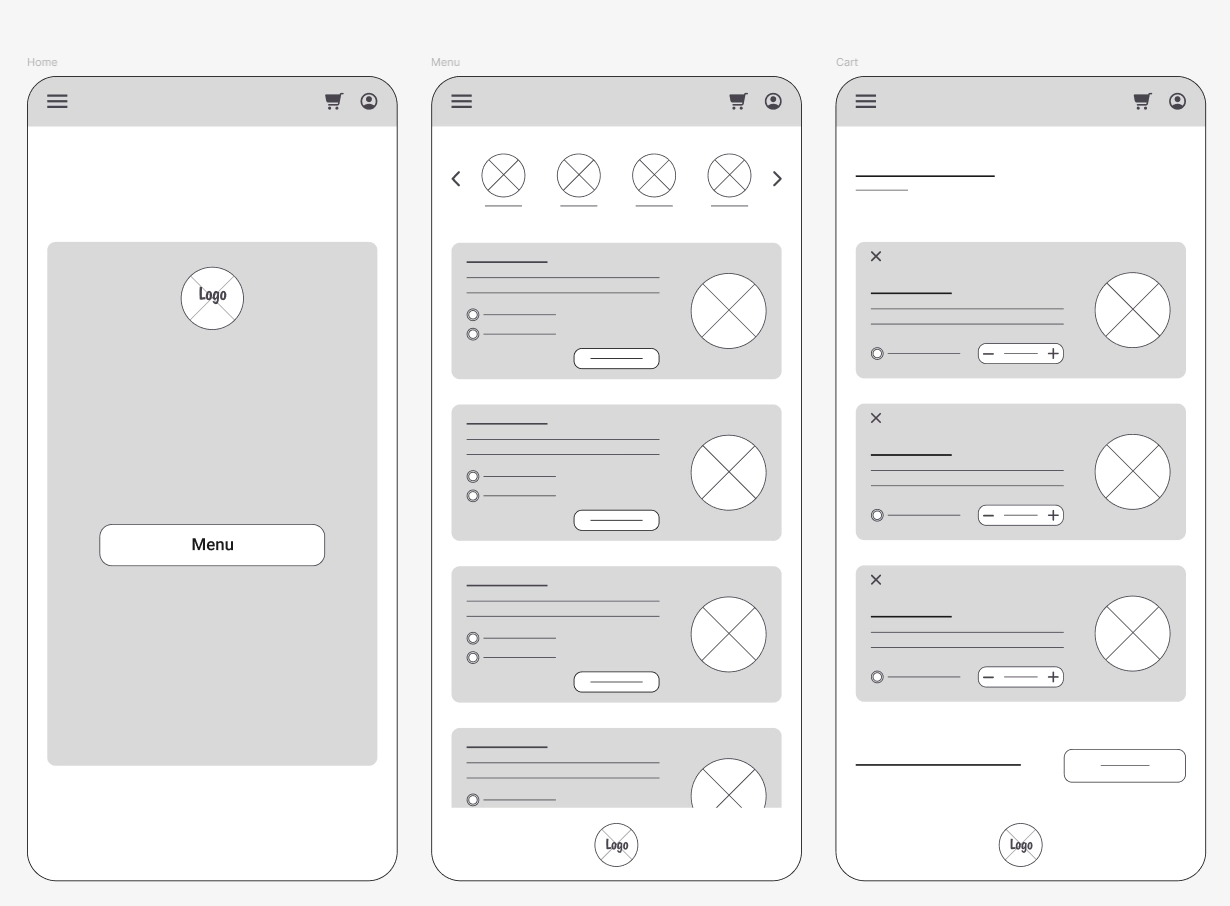
Low-Fidelity Exploration
Low-fidelity explorations were used to refine navigation structure, screen hierarchy, and interaction flow before moving into more detailed visual refinement.
The focus remained on ensuring users could browse, customize, and complete purchases with minimal friction and clear interaction feedback.
“Strong interaction patterns emerge when every element on the screen serves a clear decision-making purpose.”
Visual Refinement
The visual refinement phase focused on improving hierarchy, strengthening CTA visibility, and creating a cleaner, more cohesive ordering experience across the platform.
Layouts, interaction components, and ordering states were refined to support faster decision-making and clearer navigation throughout the purchase journey.
Final Prototype
Final prototypes refined responsive behavior, transition consistency, and interaction feedback across the ordering experience.
Micro-interactions and confirmation states were introduced to improve clarity, reinforce confidence, and create a smoother end-to-end ordering flow.
From Static Menu to Connected Ordering Experience
The redesign transformed Touska from a static menu experience into a fully connected digital ordering platform.
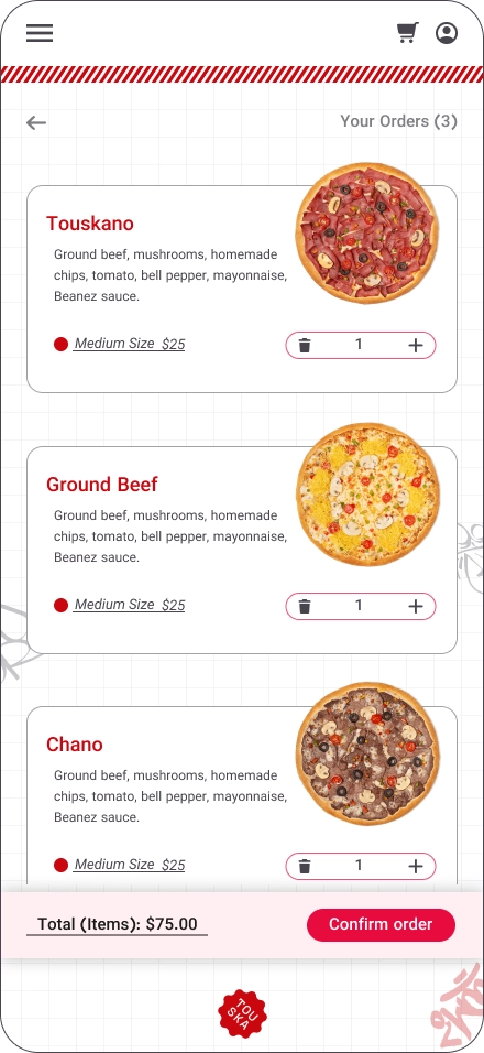
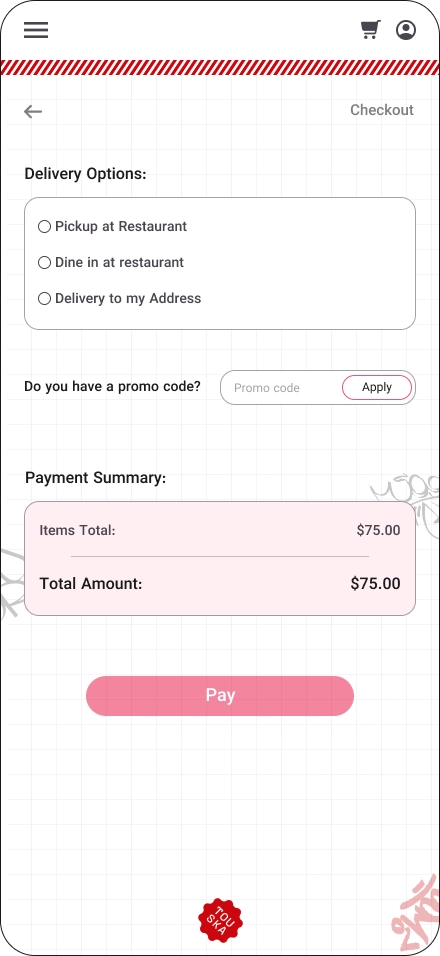
Users can now browse items, customize orders, choose between dine-in, pickup, or delivery options, complete purchases online, and follow their order status through a more structured and seamless flow.
The introduction of cashback rewards also created stronger incentives for repeat purchases and supported long-term customer engagement through a more loyalty-focused experience.
Reflections
This project explored how reducing friction across ordering, checkout, and fulfillment flows can transform a simple browsing experience into a more complete and user-centered digital service.
Interested in collaborating or discussing a project?